 Has this representational painter lost his mind? What is this abstract piece of crap a five year old can paint doing on this site?
I can't tell you how many times I have heard sentiments similar to those. As a representational artist, I sometimes feel I'm supposed to hate abstract and other forms of art. At least that's what the majority tell me. But I can't. I never did like elitism much, whether it came from someone else's camp of thought or my own. I've learned too much from abstract art. While much of it I do consider poorly done, I love a good, strong abstract pattern. I think it is probably the most important element when designing a composition. And one often overlooked.
It's interesting when we break something down to its simplest form how strong it still holds up as a composition. In graphic design the #1 rule is contrast. In painting it should be the same. An unequal proportion of size, shape and value are far more interesting than equal proportions. Notice how the majority of this work is dark, but you can clearly see where the artist is using contrast of shape and leading lines to create a center of interest. The shapes are varied in size and form, but you can see the repetition of shapes within the work and how the vertical lines break the diagonal perspective lines to create variety and interest. All masterfully done.
Well, this abstract piece of art is really John Singer Sargents "A Street in Venice" broken down to just two values, black & white. Here you can see the full painting. Now the dark shapes are something, windows, doorways, etc. But, by it being a form our mind can label as something we're familiar with, it doesn't lessen the underlying abstraction. In fact, I believe it adds to it.
 When I start a painting I am very interested in that pattern. I think it sets the mood and emotion of the piece.
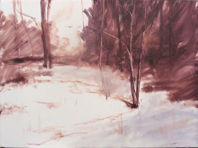
Below is the underpainting I often do on my work. This is the first stage for one I have in the works. You can see how 2/3rds of the painting will be light, while 1/3 will be dark. You can begin to see how the lines are leading to the focal area. One of the things I know I will need to keep in mind when painting this is that the background trees will need to be kept as a secondary focal area and subordinate to the main focal area in the foreground tree. There are many ways to do this and I will discuss them in another post.

I often paint this abstract pattern first in order to help me know if the painting is heading in the direction I want. If I don't find this pattern interesting, I'm sure others won't either, and will pass my work right up. In my opinion, it's one of those things that separates the pro from the novice.


