skip to main |
skip to sidebar
 Painting Demonstration & Raffle
for the Illiana Artists Meeting
(This demonstration is open to the public)
Monday, September 14, 2009, 7:15 pm (after the meeting)
Westminster Presbyterian Church
8955 Columbia Avenue, Munster, IN 46321
(located across the street from Community Hospital in Room 305, South-side of the church).
I will be instructing the participants of this event on my process of working and painting outdoors (or indoors) while working from a photograph during the meeting. I will address the unique challenges of outdoor painting and show how to overcome them by using a simple, straightforward approach. Topics covered include: picking a composition, massing the values of light, and how to make the most of a limited color palette.
Raffle Prize
Also, I will be donating the demonstration piece for a raffle prize during the event. Talk about an inexpensive way to get a vanderVinne!
For more information visit
http://us1.forward-to-friend.com/forward/show?u=f8fd98b2e25a323cb1242fc55&id=3f821def09
or contact me at 219.241.1392 or reply to this email.
“Celebration of the Arts” A Schoolhouse Shop Art Fair
Saturday – Sunday, September 19-20, 2009
Schoolhouse Shop
278 East 1500 North
Chesterton, Indiana 46304
I will be exhibiting along with many other artists on the grounds of the Schoolhouse Shop for the “Celebration of the Arts” Fair. Many new works will be exhibited and for sale, so stop on by my booth to see what I've been up to.
 I am happy to announce that my painting "Down from Andershock's" has won a Merit Award at the Hoosier Salon Member Exhibition.
The painting was painted en plein air on a beautiful Sunday morning. I had grabbed my plein air kit and left the house early, before anyone else was up. After driving around for a short while, I came upon this little garage/shed hidden away behind a local farmer's market building called Andershock's, on an off-road from HWY-20 and HWY-49. I pulled to the side of the road, lifted the trunk on the van for shade and set up to paint. After a while, I saw red lights flashing, a police car pulled up behind my van and an officer got out.
At this point, I'm halfway through the painting, it's going fairly well, and I don't want him to make me pack up and leave. After all, I'm just standing on the side of the road, keeping to myself—though I do realize this is not my property. So, I greeted him with a big smile and a "Hello". And with a stone face, he asked what I was doing. "Just painting," I told him. He said he just wanted to make sure there wasn't any trouble. Whether he meant my being in trouble, or me causing trouble, I'm not sure. He looked at what I was doing and mentioned it was looking pretty good. I tried to make some small talk, but he didn't say much, just stood there mostly. I knew the light was changing quickly, so I went back to painting the piece. He began to watch me paint. After a short while, he nodded, told me to have a nice day, got back in his car and drove away.
I continued to paint.
Unfortunately, Andershock's has since closed and the building, along with the trees and this little shed, have all been torn down. At least, I can look at this painting and remember it all.
 Imagine you're an art collector and can have all of your favorite paintings in the world for your collection. Price doesn't matter. Availability and location are insignificant. Who cares if the artist is living or dead, famous or unknown, modern or realistic. What art pieces would you have on your walls? What inspires you as an artist? What major works would you have? Or what guilty pleasures would be in your collection? Do you love realist work, but would have Autumn Rhythm Number 30 by Pollock in your collection? Are you an atheist, but an iconic religious work of medieval Christianity would hang on your wall? Think like a passionate collector. Decide what those are. However, there is one restriction: You can have no more than two works of any artist.
The main idea is to find works that you like. It makes you take a closer look at your favorite artists work and discover just what it is about a piece that moves you and to begin to see things from a collector's viewpoint instead of simply from an artist's. For fun, find those works, and either print them out and collect them in a file folder, or (what I did) put them all into a folder on your hard drive and make a pdf for easy reference. You can also put them on a wall in your studio for inspiration. Like all art collections, this will change over time as artists produce new work and as you discover pieces you never knew existed. Also, over time you may begin to lose favor of some of them. You can continually add and subtract from your collection.
You can collect anything you want. The image above is a collage of some of the pieces in my dream art collection. You can see it is a little eclectic, but that's all right. I like it, and it represents who I am.
It's a fun exercise, and I'd love to know what you learned from it.
© All above images are copyrighted to their respective artists.
 Has this representational painter lost his mind? What is this abstract piece of crap a five year old can paint doing on this site?
I can't tell you how many times I have heard sentiments similar to those. As a representational artist, I sometimes feel I'm supposed to hate abstract and other forms of art. At least that's what the majority tell me. But I can't. I never did like elitism much, whether it came from someone else's camp of thought or my own. I've learned too much from abstract art. While much of it I do consider poorly done, I love a good, strong abstract pattern. I think it is probably the most important element when designing a composition. And one often overlooked.
It's interesting when we break something down to its simplest form how strong it still holds up as a composition. In graphic design the #1 rule is contrast. In painting it should be the same. An unequal proportion of size, shape and value are far more interesting than equal proportions. Notice how the majority of this work is dark, but you can clearly see where the artist is using contrast of shape and leading lines to create a center of interest. The shapes are varied in size and form, but you can see the repetition of shapes within the work and how the vertical lines break the diagonal perspective lines to create variety and interest. All masterfully done.
Well, this abstract piece of art is really John Singer Sargents "A Street in Venice" broken down to just two values, black & white. Here you can see the full painting. Now the dark shapes are something, windows, doorways, etc. But, by it being a form our mind can label as something we're familiar with, it doesn't lessen the underlying abstraction. In fact, I believe it adds to it.
 When I start a painting I am very interested in that pattern. I think it sets the mood and emotion of the piece.
Below is the underpainting I often do on my work. This is the first stage for one I have in the works. You can see how 2/3rds of the painting will be light, while 1/3 will be dark. You can begin to see how the lines are leading to the focal area. One of the things I know I will need to keep in mind when painting this is that the background trees will need to be kept as a secondary focal area and subordinate to the main focal area in the foreground tree. There are many ways to do this and I will discuss them in another post.
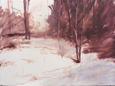
I often paint this abstract pattern first in order to help me know if the painting is heading in the direction I want. If I don't find this pattern interesting, I'm sure others won't either, and will pass my work right up. In my opinion, it's one of those things that separates the pro from the novice.
 One of California's most notable Impressionists and considered the first resident Impressionist of the state. At the age of two and a half, Granville caught scarlet fever which eventually made him totally deaf. In 1879, he attended what was then called the Institution for the Deaf, Dumb, and Blind at Berkeley (now called the California School for the Deaf) in Fremont, CA where a teacher recognized his artistic abilities and encouraged his drawing skills, sculpture and pantomime. After graduation, in 1890, he enrolled in the California School of Design. In 1893, with a stipend from the Institution for the Deaf, he went to Paris and enrolled in the Académie Julian. After five years in France he returned to California.
 While living in Los Angeles, he became friends with Charlie Chaplin, who helped in perfecting his pantomime techniques. Charlie sponsored him in silent acting roles and was cast in seven silent movies with Chaplin. Granville often used sign language while in these roles. Charlie was a long-time patron of Granville's art, and set up a studio for him on a movie lot.
Redmond's early works were mostly moody tonal landscapes and scenes. He painted around the Laguna Beach, San Pedro and Catalina Island. By 1905 Redmond was receiving considerable recognition as a leading landscape painter and bold colorist.
 He spent time in various Northern California locations, studying and painting. About the time he moved farther north to San Mateo, Redmond turned to painting sweeping terrains with colorful wildflowers, especially the purple lupine and the golden poppy, California's state flower. This subject is what he became known for at the time. He style became linked to Impressionism, though he was motivated more by his subjects than by any aesthetic theory. West Coast critics at that time noted his use of pointillism and likened his art to that of Claude Monet and Camille Pissarro. Although Redmond recognized the public's preference for his brightly colored poppy pictures, he generally preferred to paint darker, more poetic scenes.
 I wanted to let everyone know I am conducting a 1-day plein air workshop this Saturday, June 20th. We will be meeting at the Chesterton Art Center in Chesterton, IN at 8 am and traveling to a nearby location from there and end the day around 4 pm. I will do a quick demo in the morning and discuss several aspects of painting outdoors. Then the students will be sent off to paint and I will teach in a more one on one fashion, addressing each student's individual needs and concerns.
Cost for the workshop is $50. For a supplies list and more information, please contact me at 219.241.1392 or through email at mark@vandervinnestudio.com. This is always a fun time and I hope you can come join us.
 Talking with a friend the other day I mentioned painting en plein air. I pronounced it "en pline air" out of habit, and he questioned my pronunciation. He thought it was pronounced "en plane air". So I thought I would seek the truth out. Little did I know we were both wrong, and I am still trying to kick the habit of pronouncing it incorrectly. To hear it pronounced properly (in a wonderful French accent) visit this link.http://www.merriam-webster.com/cgi-bin/audio.pl?fwenpl01.wav=en plein air'Which got me wondering why we use French words for so much art related stuff? En plein air, atelier, grisaille, giclée, trompe l'oeil, avant garde, art neaveau and art deco to name a few. Let's face it, most of these words describe ordinary things. It's not like "amore" or "raison d'ete" which have a deeper meaning to them than their English counter parts.
En plein air, literally translates to in open air. So "painting en plein air" is "painting in open air". I don't know about you, but I know I don't talk that way. Now, imagine simply telling a person you were outside when you painted it, instead of "en plein air". Would someone think less of the piece? Would it really sell for less than the value the artist or buyer has placed on it? Recently I heard someone calling it wilderness painting, which is nice, but doesn't capture the idea if you're painting in a city, suburb, small town or even on a farm. I've heard some artists use the term alla prima painting. While most plein ain air work is done alla prima (or all at once) it doesn't describe the act of painting on site. Also it's an Italian term, with premier coup being the French equivalent. So I guess we artists are not just prone to taking words from France, but Italy, too. Being of Dutch origins (though wholly American), I wonder if I can start using Dutch words to describe art related things. After all, we owe a lot to the Dutch painters, too. Op plaats means on site.
One of my personal favorite artspeak words is giclée. According to Wikipedia, the word giclée is derived from the French language word "le gicleur" meaning "nozzle", or more specifically "gicler" meaning "to squirt, spurt, or spray." Imagine telling a client that the giclée print you just sold them was printed on an ink-jet printer? After all, that is what a giclée is: a recently invented name for the process of making fine art prints from a digital source using ink-jet printing. In the graphic design world, we simply call it digital printing. Off-set printing is probably the best form of printing but can be very expensive, especially for small runs, probably why artists don't use it often. Iris prints are a form of giclée, just printed specifically on an Iris printer. It still sounds nice, but doesn't hide the fact of what it is. So why the term giclée? To make it sound better than what it is?
And how about "atelier"? Another one of my favorites. it means an artist studio or workroom. Recently, though we seem to have changed the meaning. It is often used as a shortened version of The Atelier Method which "is a form of private instruction in which an artist, usually a professional painter, works closely with a small number of students to progressively train them." (Wikipedia, again.) So basically, the word means art studio, but the new meaning is an art school founded and taught by one artist often out of his studio. Hmm? Does it make the artist sound more legit as an artist? More professional?
So why do we use these foreign words instead of our English language counterparts? Is it strictly a marketing tool to make something sound better than what it is? Like Jeep's "Trail Rated" — it doesn't mean anything, but is speaking to the target audience as a marketing communication tool. Or are we trying to mask what it really is?
My philosophy is simple. It's the KISS philosophy. I prefer to keep it real and simplify it as best as I can. So while I use some of these terms, I also find that I do what I can to explain what they really are. After all, if we are ashamed of what they really mean, we, as artists, shouldn't be using the terms. And, if we are trying to purposefully mislead people, then ethically we should be ashamed of ourselves.
The really funny thing is that after doing even more research I have discovered even the word "art" is of French origin. So they invented art? Well, the Lascaux Caves are in southwestern France. And France has more Upper Palaeolithic period (40,000 to 10,000 BC) paintings than any other European country. So maybe they did invent art and that's why we use their language more than others to describe it.


 Posts
Posts

