skip to main |
skip to sidebar
 I will be conducting a 6-week course that focuses on understanding and painting the principles of the landscape. Each week a different aspect will be covered, from creating a center of focus, to massing and value patterning, to understanding how color effects the composition. Examples from master artists (living and dead) will be used to help the student further understand the principles, as well as demonstrations given. Mostly, though, I believe we learn from doing, so hands-on in-class assignments and individual attention to the students will be stressed. To sign up, or for more information, contact me at 219-241-1392 or by email at mark@vandervinnestudio.com.
Composing the Landscape: A Course in the Principles of Landscape Painting
Saturdays from 1:00 pm to 3:30 pm
April 3 – May 15th (Note: there will be no class on April 17, as I will be out of town.)
Southern Shore Arts Gallery, Backroom
722 Franklin Street Michigan City, IN 46360-3506
Learning to see the landscape in a simple way is key to the painter of the outdoors. Simplifying is not always easy, but essential to the artist. One of the easiest ways to see the landscape is to break it up into 4 planes of value and light. These planes are based on the idea that an object receives differing degrees of light according to the angle at which it is situated to the light source. The basic theory is that from the point of observation, flat planes receive more light than angled ones, which receive more light than vertical ones.
With that in mind, it follows that there are basic elements in a landscape that have these angles. They are:
1. The Sky. The sky is almost always the lightest value in nature, as the light from the sun radiates throughout it. This is true even at night.
2. The Ground. Being the flattest plane and directly perpendicular to the light source, the ground gets the most light and is therefore the next lightest value.
3. Slopes. Slopes such as mountains and hills receive the next most amount of light. Because they are slightly vertical, they don't get as much light as the ground.
4. Verticals. Trees and buildings often are vertical in shape and get the least amount of light.
In the below diagram you can see the basic ideas of the theory of angles and how it relates to the landscape.
 And here are a couple photos where you can see this in practice in nature. Squint and you can really compare the values.
 In the above photo, notice how the angle of the bale of hay (a) darkens as it gets more vertical. Also notice, since light is traveling through the clouds and they are considered to be part of the sky, even their shadows are lighter than the ground plane.
 In the above photo, notice how the angle of the smaller trees (3) is different, and therefore lighter, than the trunks of the trees behind them.
 This is a photo by Lumiere Technology in Paris showing the site of a fingerprint on a painting that art experts now believe is a newly discovered Leonardo da Vinci. Peter Paul Biro, a Montreal-based forensic art expert, said that a fingerprint on what was presumed to be a 19th-century German painting of a young woman has convinced art experts that it's actually a da Vinci.
"Leonardo used his hands liberally and frequently as part of his painting technique. His fingerprints are found on many of his works," Biro said. "I was able to make use of multispectral images to make a little smudge a very readable fingerprint."
The unsigned chalk, ink and pencil drawing, known as "La Bella Principessa," is believed to be the daughter of a 15th century Milanese duke, and is now valued at $150 million.
If da Vinci were alive today, I think he'd get a kick out of the idea of using scientific methods such as these to confirm the validity of paintings.
For a full story follow this link:
http://news.yahoo.com/s/ap/cn_canada_da_vinci_discovery
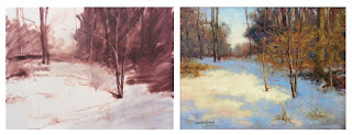
 A few posts ago, I wrote about the underlying abstract pattern in composing a painting. As a demonstration of the concept I had shown a piece in which I'd only laid the initial block-in down. I often start my pieces that way. What I wanted to show here, though, was the finished piece. You can still see how the abstract dark/light value pattern is maintained here, even with the varying colors. Because of that pattern underneath, a wonderful sense of light is created along with maintaining the strong composition. There is still a wide level of value within that pattern, but those values stay within the ideas of shadow and light. Below is the side by side comparison of the start and finished painting.
 Painting Demonstration & Raffle
for the Illiana Artists Meeting
(This demonstration is open to the public)
Monday, September 14, 2009, 7:15 pm (after the meeting)
Westminster Presbyterian Church
8955 Columbia Avenue, Munster, IN 46321
(located across the street from Community Hospital in Room 305, South-side of the church).
I will be instructing the participants of this event on my process of working and painting outdoors (or indoors) while working from a photograph during the meeting. I will address the unique challenges of outdoor painting and show how to overcome them by using a simple, straightforward approach. Topics covered include: picking a composition, massing the values of light, and how to make the most of a limited color palette.
Raffle Prize
Also, I will be donating the demonstration piece for a raffle prize during the event. Talk about an inexpensive way to get a vanderVinne!
For more information visit
http://us1.forward-to-friend.com/forward/show?u=f8fd98b2e25a323cb1242fc55&id=3f821def09
or contact me at 219.241.1392 or reply to this email.
“Celebration of the Arts” A Schoolhouse Shop Art Fair
Saturday – Sunday, September 19-20, 2009
Schoolhouse Shop
278 East 1500 North
Chesterton, Indiana 46304
I will be exhibiting along with many other artists on the grounds of the Schoolhouse Shop for the “Celebration of the Arts” Fair. Many new works will be exhibited and for sale, so stop on by my booth to see what I've been up to.
 I am happy to announce that my painting "Down from Andershock's" has won a Merit Award at the Hoosier Salon Member Exhibition.
The painting was painted en plein air on a beautiful Sunday morning. I had grabbed my plein air kit and left the house early, before anyone else was up. After driving around for a short while, I came upon this little garage/shed hidden away behind a local farmer's market building called Andershock's, on an off-road from HWY-20 and HWY-49. I pulled to the side of the road, lifted the trunk on the van for shade and set up to paint. After a while, I saw red lights flashing, a police car pulled up behind my van and an officer got out.
At this point, I'm halfway through the painting, it's going fairly well, and I don't want him to make me pack up and leave. After all, I'm just standing on the side of the road, keeping to myself—though I do realize this is not my property. So, I greeted him with a big smile and a "Hello". And with a stone face, he asked what I was doing. "Just painting," I told him. He said he just wanted to make sure there wasn't any trouble. Whether he meant my being in trouble, or me causing trouble, I'm not sure. He looked at what I was doing and mentioned it was looking pretty good. I tried to make some small talk, but he didn't say much, just stood there mostly. I knew the light was changing quickly, so I went back to painting the piece. He began to watch me paint. After a short while, he nodded, told me to have a nice day, got back in his car and drove away.
I continued to paint.
Unfortunately, Andershock's has since closed and the building, along with the trees and this little shed, have all been torn down. At least, I can look at this painting and remember it all.
 Imagine you're an art collector and can have all of your favorite paintings in the world for your collection. Price doesn't matter. Availability and location are insignificant. Who cares if the artist is living or dead, famous or unknown, modern or realistic. What art pieces would you have on your walls? What inspires you as an artist? What major works would you have? Or what guilty pleasures would be in your collection? Do you love realist work, but would have Autumn Rhythm Number 30 by Pollock in your collection? Are you an atheist, but an iconic religious work of medieval Christianity would hang on your wall? Think like a passionate collector. Decide what those are. However, there is one restriction: You can have no more than two works of any artist.
The main idea is to find works that you like. It makes you take a closer look at your favorite artists work and discover just what it is about a piece that moves you and to begin to see things from a collector's viewpoint instead of simply from an artist's. For fun, find those works, and either print them out and collect them in a file folder, or (what I did) put them all into a folder on your hard drive and make a pdf for easy reference. You can also put them on a wall in your studio for inspiration. Like all art collections, this will change over time as artists produce new work and as you discover pieces you never knew existed. Also, over time you may begin to lose favor of some of them. You can continually add and subtract from your collection.
You can collect anything you want. The image above is a collage of some of the pieces in my dream art collection. You can see it is a little eclectic, but that's all right. I like it, and it represents who I am.
It's a fun exercise, and I'd love to know what you learned from it.
© All above images are copyrighted to their respective artists.


 Posts
Posts

