skip to main |
skip to sidebar
As we live with a piece over time, we get to see the good and bad within it. Commonly, I don't go back into a piece of art, especially one that has been around my studio for a couple years. I did so recently with a large 24" x 36" painting. I always liked the piece, but couldn't initially quite put my hand on what bothered me about it. So I showed it once or twice at most, but mostly it hung on the wall in my home. My wife said she liked it, but every time I looked it over, it just wasn't what I wanted out of it. Time and thought clarified the problems. I realized overall it didn't look unified, so I went back into it. Here's my reasoning and what I did to create a stronger painting.
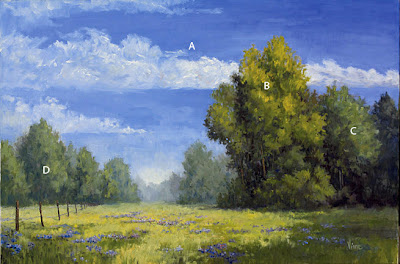
• The sky (A) needed to be more unified with the painting. As it was, the clouds cut the painting too drastically and didn't repeat shapes used throughout the piece. Also, the blue of the sky was too uniform in color (ultramarine blue+white) and needed more variation.
• The focal area (B) needed to be more dramatically accentuated. I did this by using more intense colors in the focal area and adding some more detail.• After painting B, I quickly realized I needed to create some more unity and balance in the trees to the right of the focal area (C). To do so, I added some more detail into those trees and created more interesting shapes within the shadow and light areas, as well as where the trees meet the sky.• Finally, the trees on the left (D) needed to be addressed. They were far too uniform in shape and color. The other thing I noticed was that the background led straight to the sky, creating an unrealistic visible distance. I decided I wanted the background to be led around the group of trees to the left, not continually go farther and farther in the distance. I reworked these concerns at the same time.Here is the final painting and the two side by side. Unfortunately you can see I'm getting a little light spilling into the top of the reworked painting. You can click on them for a larger viewing size. Slowing Summer 24" x 36"
 Sometimes I wish I could get to that stage a lot faster, but art doesn't always allow that to happen. Sometimes living with a piece is of great importance. On Scott Christensen's website he has a quote from Ernest Hemingway. I think it does a decent job of summing up what it actually takes to create a piece of art work that we, as artists, can be proud of and let out of the studio.Excerpt from "Ernest Hemingway On Writing."
"Would like to finish this [A Farewell to Arms] down here if possible, put it away for a couple or three months and then re-write it. The re-writing doesn't take more than six weeks or two months once it is done. But it is pretty important for me to let it "cool off" well before re-writing.
~to Maxwell Perkins, 1928 Selected Letters~
 Often artists will return to a theme in their work, whether consciously or unconsciously.
Being a landscape painter, I find myself attracted to roads or paths and to streams. The symbolism to me, represents the journey of life. Also, I find myself consistently repeating the theme of being separate or apart, both as an individual and as a journey taking step, removing oneself from the familiar. Sometimes I view and portray this in a positive light, but other times I understand the struggle inherent in being different from the norm or separate from the crowd. I often portray this in my work with the use of single and groupings of trees. The single tree is almost always representative of the individual, but a group can be either peer or familial groupings. And at times, like in the painting, The Leaving, I incorporate both ideas of the stream as life journey and the separation aspect into the same painting.
 16" x20" – Spring Dune
I had taken the photo of this scene a few years ago. While digging through my photo box I found it and painted a little study of it (see below). I liked the study so much I tried my hand at making it into a larger painting. Fortunately, I am not too disappointed in either of them. Though I will say, the main focal area is still trees. For some reason I can't seem to pull myself away from them.
 6" x 8" Small Work
 Madame Gautreau was an American expatriate who married a French banker. She was renowned for her beauty and recognized as a new type of Frenchwoman, with elite status and sophistication. Sargent was so impressed by her beauty that he asked a mutual friend to talk to her about posing for him. He believed that by painting her portrait, he could garner attention as an artist and receive more portrait commissions. Although she had refused numerous similar requests from artists, Gautreau accepted Sargent's offer. Sargent was an expatriate like Gautreau, and their collaboration has been interpreted as motivated by a shared desire to attain high status in French society.
When the painting was shown in the Paris Salon of 1884, it immediately became scandalous for its suggestive sexuality, and the relatives of Mdme Gautreau requested that is be taken down. It was left hanging. Initially, Sargent was to give the painting to the Gautreaus, but after their response he feared them destroying what he considered his best work. So he took the painting down before the end of the show, where it stayed in his studio until he sent it to the Metropolitan Museum in New York. He was so ashamed by the scandal that Sargent moved to London soon after.
What I find even more amazing is what happened next. Sargent then went back into the painting and repainted the strap of the dress that hung down from Mdme. Gautreau's shoulder, and changed its name from Portrait de Mdme *** to Madame X. This changed the piece drastically. And, it was not discovered that he altered the painting for close to a hundred years, until the art scholar Trevor Fairbrother discovered it in an old photograph depicting the Salon (see below).
Funny how a little thing like a strap can change something so drastically. Below you can see the final painting as it hangs in the Met in New York, a photo of the painting as it hung in the Salon in 1884, and how it may have appeared (altered by artist Mike Pieczonka). It may no longer be seen as offensive, but in my eyes is a much weaker piece. The lowered strap changes the composition and feeling of the piece. It no longer has the feeling of a woman acknowledging her independence and sexuality. Now I see it as a true masterpiece and can believe it is one of his best works. And I wonder if he were still around today, in these times, would he change it back. This raises the question of self-censorship, though. As artists we are influenced by the culture around us, and by the people around us. Can we become too engrossed in what people think about our art that we forget what it was we were wanting out of painting? How easy is it to cross that line? How easy to simply paint what has sold before and sit on our laurels instead of pushing these boundaries and testing our ideas of what art can be? And what it means to ourselves? And as artists can we do this to ourselves? We ask each other for critiques of our work, to improve and grow as artists, also for a fresh eye perspective. And while I know we use these artistic critiques to learn and grow, can asking opinions of others lead to self-censorship? I'd love to hear your thoughts.
http://jssgallery.org/paintings/Madame_X.htm
The Informal (or Free Form) Division Grid is taken from Andrew Loomis' book Creative Illustration. It offers greater freedom to the artist, but at first may take a little getting used to. The big key is to make sure that you divide the space unequally as to not create a symmetrical design.
 A. "Start by dividing the whole space unequally with a single line. It is best to avoid placing the line at a point which would be one-half, one-third, or one-fourth of the whole space.
B. "Then draw one diagonal of the whole space from diagonally opposite corners.
C. "At the intersection of the diagonal and your first line, draw a horizontal line across the space.
D. "Now draw diagonals in any of the resulting rectangles, but only one to a space. Two diagonals crossing like an X would divide the rectangle equally, which we do not want.
E. "Now draw horizontals or perpendiculars at any intersection, thus making more rectangles to divide by diagonals again. In this manner you will never break up the same shape twice in the same way. It offers a great deal of suggestion for the placement of figures, spacing, and contours, with no two spaces being exactly equal or duplicated, except the two halves on each side of the single diagonal. If you have a subject in mind, you will begin to see it develop."
Here are a few thumbnail sketches I did using this technique. In the first and third I used the same photo reference (notice the tree on the left) to show just how varying the design can be.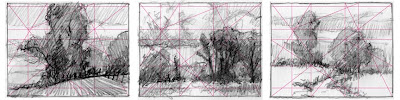
Thanks to Andrew Loomis Creative Illustration.
Graphic designers often use grids to help with placement of elements in their layouts. As painters, we can use the same idea for our compositions. We can place elements and/or the center of focus on (or near) where these lines intersect. This simple technique can help when deciding where to place elements and often create a better composition than simply "guessing" where to put them. 3rds Division Grid
One of the most common page divisions (or grids) is dividing the picture plane into thirds. Many artists find this the easiest grid to use for placement of focal area and main lines/elements.
 3rds Division
Click on image to enlarge
Another grid is the 5ths Division grid, dividing the picture into fifths both horizontally and vertically. 5ths Division
Click on image to enlarge
By putting the two above grids together, you can create a 3:5 Division.
 3:5 Division Click on image to enlarge
Then there is the simple grid that I call the Squared-Third. It is a variation on the Golden Rectangle. The picture is divided in thirds one way and the other by a square starting at any corner. Squared-3rd Division Click on image to enlarge
Irving Shapiro taught me this simple method for placement of a focal area while I attending the American Academy of Art. It's created by diagonally dividing the picture in half, and then drawing a line from an opposite corner to meet the diagonal line at a right angle.
 Right Angle
Click on image to enlarge
There are endless possibilities of grids. In fact, the next post will be about creating an informal free-form grid I learned from Andrew Loomis' book Creative Illustration. Try some of these out and let me know what you think.
Images in order:
Alberto Pasini, A Market Scene
Richard Schmid, Spring Thaw
Kenn Backhaus, Beach Cliffs
Mark vanderVinne, Left Standing
Scott Christensen, Evening Popo Agie
 A few years ago, I picked up the book Pictures and Tears: A History of People Who Have Cried in Front of Paintings by James Elkins. It is an exploration into why some people are moved to tears by paintings.
What makes a painting move someone? What is it a bout a still painting that we get so emotionally involved with? What draws us to a piece?
I have found these questions interesting for many years. After all, as an artist I do my best to put my thoughts and emotions down on canvas, and hope that others will be moved by it. Through the exploration of personal feelings I hope to find the universal feelings of others. I have something I wish to share with the world, and want others to be open to feeling it, too.
One of my art school teachers mentioned she was so moved by a van Gogh that she was brought to tears. I have never been so emotionally moved by a painting that I cried in front of it. But paintings have moved me in other ways. And I certainly find myself continually being attracted to certain pieces. One of my favorites is Toby Rosenthal's "Elaine". Every time I go to the Art Institute of Chicago I make sure I see this painting. Why? Because it does move me. Maybe not to tears, but it stirs something inside of me every time I view it. And I want to get closer to understanding that feeling inside of me.
It doesn't seem to be just the technical aspects of a painting, it's what we bring to it. If it was strictly technical, then certainly a Bouguereau would be some of the most moving pieces in the world. But they really do little for me. Technically he certainly was a master, but beyond that there is little human emotion captured on canvas, in my opinion. Which just means he's not for me. And that's fine. Others may actually cry in front of his work.
But from what I can tell, it seems that people bring their own ideas, memories and feelings to a piece. What I painted as sorrow or solemnity, someone else finds peace and hope in. That's okay. It's what makes art so fascinating to me. For instance, a close friend of mine had recently gone through some very difficult times in his life. While I can sympathize with him, I can't empathize with him as I have never been through the exact same situations. But what was going on was effecting me, too because we are such good friends. So I painted my feelings about the struggle he was having and sorrow I was feeling. I couldn't get words to describe my personal thoughts and feelings, but I found I could put them on canvas. And so I did. And I think I captured it. But other people may bring some other feelings or thoughts to the piece. Knowing that, how do I tell a collector who is interested in this painting that I was feeling these deeply sorrowful and melancholy things, when they see it as calm, peaceful and possibly uplifting? And so I don't, because I understand that their thoughts and feelings about the painting may not match mine. And I am just as interested to hear their viewpoint of it, for then I get to learn about them as human beings. And after the creation of the work, their viewpoint is as valid as mine. Though, only I will know if I captured what it is I set out to achieve.
As an experiment, find an image you like and write down your feelings about it. Have someone you know do the same. It's interesting to see how similar or different the viewpoints are. The painting hasn't changed, only the viewer.
I hope this gets you thinking. And if anyone is interested in the piece I was describing about my friend, email me at mark@vandervinnestudio.com and I'll let you know which piece it is on my website, then you can make the decision about it for yourself.
p.s. I just noticed today that James Gurney has recently posted a similar discussion. Check it out, if you get the chance at his blog: http://gurneyjourney.blogspot.com/2009/01/transmitting-emotion.html
Norman Rockwell, The Connoisseur
Toby Edward Rosenthal, Elaine, http://www.artic.edu/aic/collections/artwork/72320

 Slowing Summer 24" x 36"
 Sometimes I wish I could get to that stage a lot faster, but art doesn't always allow that to happen. Sometimes living with a piece is of great importance. On Scott Christensen's website he has a quote from Ernest Hemingway. I think it does a decent job of summing up what it actually takes to create a piece of art work that we, as artists, can be proud of and let out of the studio.


