Thursday, December 8, 2011

Uncommon Ground Show Tonight


Mark vanderVinne Solo Show
When: December 6, 2011 – March 5, 2012
Artist Opening: Thursday December 8th, 6 – 8 pm
Where: Uncommon Ground
1401 West Devon Ave.
Chicago, IL 60660

Uncommon Ground is a friendly neighborhood restaurant and bar that is unlike anything else I’ve encountered. The owners love the arts, and do everything they can to support it, from live music to hosting art shows. The food is fantastic, the restaurant is “green” and they have their own organic roof top farm, right in Chicago.

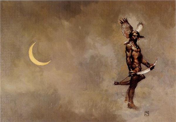
I’ll have nearly 30 original paintings available, which to my memory is the largest selection of my work at one place. I hope you can stop by the opening and enjoy some wonderful art and the incredible atmosphere of the place.

Thanks,
Mark

Monday, October 31, 2011

Working with Color: A 1-day Workshop


I will be teaching a 1-day color workshop at the Chesterton Art Center

Working with Color:
Using and mixing color with a limited palette in oils

November 19th, 9 am to 4 pm (1/2 hour lunch break)
 
Chesterton Art Center
115 S. 4th St.
Chesterton, IN  46304
219-926-4711 or gallery@chestertonart.com
$55 for CAC members, $60 for CAC non-members

This workshop will focus on the fundamentals of color mixing and usage while using a limited palette in oils. We will go over the practical application of color in paintings and delve into it with several hands-on exercises in the morning and working on a painting from a photograph in the afternoon. To enroll, or for more information contact the Chesterton Art Center or Mark vanderVinne at 219-241-1392 or markv@vandervinnestudio.com.

Wednesday, October 5, 2011

Solo Exhibit


Mark vanderVinne Solo Exhibition
"Outside & Inside: Studio and En Plein Air Paintings"
Where: Chesterton Art Center
, 115 S. 4th St., Chesterton, IN 46304
When: Show runs through October
Opening Reception: October 9, 2-4 pm

I will be having a solo exhibit of my work at the Chesterton art Center in Chesterton, IN. This is pretty cool, because it's the first time I've had a solo exhibit in the town I live. Recent work painted en plein air and in the studio will be exhibited along with a couple older pastels of the area. For more information contact the gallery at 219-926-4711 or gallery@chestertonart.com.

Thursday, July 14, 2011

Door County Plein Air Festival 2011


I am one of 40 artists participating in the Door County Plein Air Festival 2011. It has been a few years since I have been up there and I am honored to be invited. I look forward to painting with many fellow friend artists, and making new ones. The events are fantastic and the paintings available should be spectacular. For more information visit http://www.doorcountypleinair.com. I will also be bringing new works to the Cottage Row Gallery for display.

I hope to see you there.

Thursday, June 9, 2011

My other blog


All who have known me since I was a child, know I have always been into what I term fantasy art. It has many other names — fantastical art and imaginative art (to name a couple) — but I've always called it fantasy art, and old habits die hard. I've started a new blog to showcase some of the other work that I do within that genre. If you're interested, check it out. Right now the postings are limited, but as time goes by, I'm sure more and more postings will happen. http://markvfantasyart.blogspot.com/

Tuesday, June 7, 2011

Jeffrey Catherine Jones (R.I.P)


Jeffrey Catherine Jones recently passed away on May 19th, 2011. While I never knew him personally, his work has influenced me. I have bought only 5 prints: a Bernie Wrightson, a Howard Terpning, a Keith Parkinson (whch I gave to my best friend), a Richard Schmid and a Jeffrey Jones which is in my bedroom. He was influenced by many artists throughout his career. I can see Frazetta in there, along with N.C. Wyeth, Frank Schoonover, Harvey Dunn and Mead Shaeffer, and James McNeill Whistler and maybe even Vermeer and Klimt. You can also see influence by his peers at The Studio, Barry Windsor-Smith, Michael Kaluta and Bernie Wrightson. This should not detract from his work in any way, as through all of those influences and more, he was true to himself. He is not a well known artist outside of the comic and fantasy art world. That is sad, for his work goes so far beyond that and like any great illustrator removes the boundary between illustration and fine art. He struggled in his life with his art and his illnesses and his identity. I believe they were going to make a documentary of his life, but I'm unsure if it was ever produced. Thanks for the great work, Jeffrey, I hope you can find peace wherever you have gone.


Two Andrew Loomis Books Available Again


Finally, two classic Andrew Loomis books are available again. Figure Drawing for All It's Worth
(available now) and Drawing the Head and Hands (available October). Andrew Loomis is one of the best teacher's of all time and one of my biggest influences. His out of print books go for quite heady amounts of money. It's wonderful that these two classics are back in print, and I hope that more are to come. If you don't have them, I highly recommend picking them up for your library. And since my Figure Drawing for All It's Worth is worn and torn, I will be picking these up once again. Below are a few of Andrew's illustrations and paintings, so you can see just how good he was.

Tuesday, May 10, 2011

Vacuum focus

One way to create a strong center of interest is to use vacuum focus. With vacuum focus you subordinate all other areas through desaturation and hue, leaving the most intense and alien color in the focal area. Marketers use this technique a lot, especially in movie posters.

Here are two recent blockbusters. In the Batman movie poster, you can see how overall the image is cool and desaturated. The burning bat symbol is in an intense complementary color to the overall blue hue, bringing your eye immediately to it. In the Sherlock Holmes movies poster it's a little more subtle, but the same technique is used. The overall image is a fairly desaturated blue-green, but the faces of the heroes — while also desaturated — are much warmer than the surrounding elements. Notice that even though some of those elements are also people, they are still of the desaturated green color.

They also portray very different ideas...in the Batman poster, the idea of the Batman symbol burning puts to question not only Batman's world going awry, but Batman himself. While the Sherlock Holmes is clearly about the celebrity actors and their characters and relationship. But that's getting a little sidetracked.

You can even use vacuum focusing on in traditional painting.
Here are a couple landscapes using that technique.


The first image is by Dennis Sheehan. You can see how the overall feel of the piece is a cool green, but where the sunlight is striking through it is a much more intense and warmer color, kept to a fairly defined area. The second is a Jove Wang painting. Jove is quickly becoming one of my favorite artists. Here you can easily see the overall cool and desaturated colors and how the intense red and orange on the boat leap out at you, creating a strong center of interest.

When planning a painting, vacuum focus can be a great technique to bring about a strong center of interest and a stronger piece of work.

Friday, April 8, 2011

First Brush of Spring 2011


I will be participating in the Indiana Plein Air Painters & Hoosier Salon "First Brush of Spring" paintout and sale.

New Harmony Paint Out

April 14, 15, 16, 2011
New Harmony, IN

Also, I will be participating in the "Field to Finish" exhibit going on at the Hoosier Salon Gallery. The concept is you create a field study from the prior year and do a studio piece from that study. Both are on display. You can check out the Indiana Plein Air Painters website for more information. Above you can see the 6" x 8" field study titled "In Harmony" I did last year.

I hope to see you there.

Wednesday, March 23, 2011

Limited Palette


Most people know I use a limited palette in my work. While it gives me wonderful color harmony in a piece, and I can get relatively any mixed color I want, it does have some limitations. One of those limitations is that one can begin to rely on mixing the same colors painting to painting and not rely on what the painting needs or what nature is showing. For instance, it's easy to create a warm green by mixing yellow, ultramarine and red (or umber). So the next painting you want a warm green, you can find yourself habitually mixing the same green with the same percentages of mixture and not even realizing it, even though the variance of hue to saturation needed or seen may be different. While it's good to have a "voice" within our work, that voice should not come by way of reliance on habitual color mixing. So to break my own mold, I will sometimes switch a color out. Instead of Cad Red Medium, I'll use Alizarin Permanent. Instead of Ultramarine Blue, I'll add or substitute Prussian Blue.

Recently however, I did something I haven't done in a long time. I substituted all of the colors on my palette. Starting with what I learned as Rembrandt's palette (Yellow Ochre, Burnt Sienna, Black and White) Above are some quick studies I did using only Yellow Ochre, Red Umber, Ivory Black and White. I had to vary from Rembrandt's because I didn't have any Burnt Sienna in my drawer. Also, in the night scene I did add Prussian Blue to get the green of the sky the way I wanted it, since the black wasn't taking me there, but it was a small amount added to the mix, just to bump up the intensity.

On a side note: as I was painting the autumn study, my youngest daughter Zoe came into the studio to see what I was doing. She commented how nice the green grass was. When I showed her my palette, she asked where the green was? So I gave her a quick lesson on color theory and mixing. I thoroughly enjoyed the connection with my daughter I received through art.

Thursday, February 3, 2011

Google Art Project


Google and art? Who knew the pairing could be so sweet!

I found this link and info through Matthew Innis's Underpaintings blog. If you haven't seen his blog, it is truly incredible and you should go check it out. The link is at the bottom of this post. Since he did such a great job explaining what it was about, I thought I'd just let Matthew tell it:

Google has used its Street View technology to bring 17 of the world's g
reat art galleries right into your home. The recently launched Art Project offers online visitors the chance to view thousands of paintings which they might not otherwise have the opportunity to see, add their favorite images to a personal gallery, and share their gallery electronically with friends. Each painting uploaded to the site from the participating museums is viewable in detail using a custom zoom viewer, and one painting chosen from each of museums is available in extreme detail - the 17 special images were shot using "gigapixel" photo-capturing software providing pictures containing 7 billion pixels worth of information.

At first I was a bit skeptical of it all. I've seen lots of paintings online, and know matter what you do, it just doesn't come across well.
Of course, it's great that you don't have to travel to Moscow, London or Madrid in order to get the feeling and experience of great art firsthand. The web has done that for years, so it's a bit of a given. But Google got this right. The colors are gorgeous, the brushwork delicious and the overall effect astonishing. The real beauty of this technology, though, is that you can finally get up close to a work of art to see how the artist used his/her brushstrokes without the alarm going off or the security guard asking you to "step away from the painting."

Below are a few quick screen captures so you can really see what they've done. I can't wait until more museums and more works get this technology applied to them. It still doesn't beat the experience of seeing a work of art firsthand, but it is the next best thing for those of us who don't readily travel around the globe.


Matthew Innis Underpaintings blog: http://underpaintings.blogspot.com/

Friday, January 14, 2011

New Years Resolution

I commonly don't give myself New Year's Resolutions. I don't like them,mostly because i don't like disappointing myself when I can no longer hold onto them. But last year I gave myself a New Year's objective and, when I could, I implemented it. This year I am doing the same, except I'm going to tell you what my resolution is, and hopefully you'll keep me in check if you think I'm not holding up to my side of the bargain.


As a child I drew art in the fantasy and horror genre. I was a huge Robert E. Howard fan, reading nearly everything from him I could get my hands on from Wolfshead, to Black Canaan to Queen of the Ivory Coast. I was enamored with Frank Frazetta's book covers and John Buscema's representations of Conan in Marvel's Savage Sword of Conan comic book. I would spend hours copying their work. And then there were the weekends I played Dungeon and Dragons with my brother and friends all weekend long. I had a blast coming up with new creatures and monsters for us to battle — drawing them out in great detail along with figuring out their Armor Class and Hit Points and such (for us D&D geeks). I used to know all of the fantasy and sci-fi book cover artists/illustrators (and mostly still do). I would walk around the book store and test my girlfriend (now wife). "Who painted this one?" I'd ask her, picking up the latest book by Tim Powers with a James Gurney cover, or a Stephen R. Donaldson with an illustration by Darrell K. Sweet. I'd buy the books of the artist when I could, such as Wonderworks by Michael Whelan.
I was also big into certain comic books and movies like Star Wars and the beautiful animation and story of The Secret of Nimh where I could escape to another world. I still love animation, and most recently went to see Tangled — ah, the opening sequence of composition, camera angles and viewpoints alone is amazing and well worth the price of admission. But I digress.


Art school introduced me to both fine art and illustration and I held both in high regard. Richard Schmid hung on the hallway wall alongside Haddon Sundblom and Thomas Blackshear. It was also where i was introduced to NC Wyeth.

After art school, I did some freelance illustration, but nothing like what i really wanted to do. Layouts of interiors with furniture for a photography studio mostly. I then got into advertising and have been a designer/art director since. A little over 10 years ago I began to get back into drawing and painting, first with pastels then with oils. I started with the landscape, because it was around me and I wanted to draw from life. And, of course, I liked it. So I followed that path. And it has been wonderful and fulfilling in so many ways.

But I draw so much more than that. I have been hesitant to show others what else I do, because I have begun to build this little village of landscape art and hope it continues to grow into a city, per se, and don't want to see it fall. But I've also learned it's not the only village I want to build and see grow. As artists, we may paint for ourselves, but we only feel complete if we share it so the work can connect with others. It's an odd mix of selfishness and selflessness. Of doing something for ourselves and giving it all away for others.

And that is where my New Year's resolution comes into play. This year I am going to open up more; show work I haven't shown before of all genre's, from my landscapes to my figurative to my fantastical works. Discuss artwork I've created on a deeper and more emotional level. I don't know how others will respond — I hope positively. (Somewhere in the back of my brain I can still hear my mother say, "That's nice, but why don't you paint something pretty?") I will continue painting and sharing the landscapes as well. I also plan to continue teaching workshops this year as I've done in the past, sharing what I've learned — and continue to learn — with others, there and on this blog.

I am excited about the year ahead and the possibilities it holds.