Friday, April 18, 2014
My Blog Has Moved
I have moved my blog to my website. You can check it out here at www.vandervinnestudio.com.


Wednesday, March 12, 2014
In the Midst of Spring

This painting is available. For information on the piece, contact me at 219-241-1392 or by email at studio@vandervinnestudio.com.
Monday, January 20, 2014
Uselss Art

A decent video from TED, about how an art curator learned to love the simple and silly as much as the "serious" aspects of art. Worth the watch.
http://www.ted.com/talks/luke_syson_how_i_learned_to_stop_worrying_and_love_useless_art.html
Thursday, January 2, 2014
Sargent Watercolor Discussion

The Museum of Fine Arts in Boston has uploaded a conversation with Richard Ormond, grandnephew of John Singer Sargent and one of the foremost authorities on the painter and the man. This man knows probably more about Sargent than anyone else and is a very informative discussion of the man and his work. The video is an hour long. and also gives some insights into Sargent's models and studio. http://www.mfa.org/sargent-lecture
The exhibition will continue through January 20, and there's an excellent catalog of the show.

Monday, October 14, 2013
Midwest Museum of Art – Best Painting Award


I am honored to have won the Best Painting Award at the 35th Regional Exhibit at the Midwest Museum of Art for my oil painting "Finding the Path". The night was a truly spectacular night as I was greatly surprised to not only have both of my pieces get into the show, but also both receive a purchase award. And then to find out I received the Best Painting Award...well, I was simply floored by it all.
Along with this honor, I will be giving a noontime talk on Thursday, October 24th at the museum.
Wednesday, April 10, 2013
Value Palette
My palette is made of glass and sits on a taboret. Sure, it's not the epitome of a set-up, but neither is my studio. But we do what we need to do to make things work. I love the glass palette, because it is easier to scrape off the paint when it dries. Which it sometimes does. Also, with a wood palette you must repeatedly put linseed oil on (and the oil from the paint soaks into the wood) to create a glass-like surface. Well, then why not just go with glass?
Anyway, if you notice on the palette I set up my paints the same way every time, from lightest color to darkest color, going from left to right. The set-up is the exact same on my field easel. I do this so I can instinctively reach for the color without having to look for it each time I want it. Painting is hard enough, so I try to set things up to make the little things easier and simpler.
Underneath the palette are white gripper sheets used for protecting the inside of your cabinet, found at the local superstore. Because I usually don't tone my canvases, I want to be able to see the color as pure as possible against white. I have thought about putting down a middle gray underneath, too. But right now it's still white.

 Because I have been wanting to understand and work with values better, I have printed out two 9-step value strips and placed them underneath the glass. So when I mix a value, I can compare it to the strip to see approximately what value I have mixed. It's interesting how sometimes I'll mix a 6 or 7 and believe it's a 4 or 5. This also helps to keep the overall value relationship of the painting. I don't really use it once I have a set value for the painting, as all subsequent values will be compared to the first one I mixed. As an example, in the first photo I have begun to mix color piles for the painting that is now on my easel. Because these are for the sky of the painting, I want to make sure I keep the values the same, but have different hues to mix in the sky (see my post on Color Variation.) The color to the far right is a near black and not intended for the sky. I usually mix it early so I have a comparison of the full spectrum of value.
Anyway, if you notice on the palette I set up my paints the same way every time, from lightest color to darkest color, going from left to right. The set-up is the exact same on my field easel. I do this so I can instinctively reach for the color without having to look for it each time I want it. Painting is hard enough, so I try to set things up to make the little things easier and simpler.
Underneath the palette are white gripper sheets used for protecting the inside of your cabinet, found at the local superstore. Because I usually don't tone my canvases, I want to be able to see the color as pure as possible against white. I have thought about putting down a middle gray underneath, too. But right now it's still white.


Thursday, August 2, 2012
Creating a Quality Focal Area
 |
| The Given Place |
All composition is based around placement and delineation of the center of focus, or focal area. The decision of what you want to be your focal area is as personal as the subject matter. Whatever you decide, there are several ways to make sure it remains the focal area.
Here are 9 ways to create a focal area. It is probably best to use more than one of these. Too many though and you may create a bullseye effect, where the eye doesn’t leave the focal area and wander around the rest of the painting.
- Placement in the Picture Plane. Where the focal area is placed can help to naturally lead the eye to it. The grids discussed earlier are beneficial in understanding where to place the focal area.
- Highest Contrast of Values. Placing the highest contrast of values next to each other in a painting. This does not have do be the lightest light and the darkest dark in the painting (though often is), just the highest contrast between values.
- Most Intense Color. Where the purest and most intense color is used.
- Hardest/Sharpest Edge. Where the hardest, or sharpest edge in the painting are placed. (This commonly is used along with high contrast.)
- Highest Level of Detail. The place where the most detail in the painting is found.
- Alien Color. The eye is naturally drawn to things that are not like other things. So a color not used anywhere else in the painting will automatically differentiate an area and draw the eye to it.
- Alien Shape. Using the same idea as Alien Color, it's a shape that is not used anywhere else in the painting. (i.e. a geometric shaped barn in the middle of a grouping of organically shaped trees.)
- Face Factor/Building Factor. Our mind create faces in objects that aren't human (i.e. the man in the moon, or Nixon on a potato chip.) A face will immediately draw the eye to it, whether it is human or animal. Single man made structures, like barns, signs and such will do the same thing.
- Texture. The place where the thickest amount of paint is used (impasto)
While some of these have a stronger visual pull than others, the key to making all of these work is making sure that areas of interest in other parts of the painting are subordinate to the center of focus. When looking at paintings, try to figure out which elements the artist has used to create a center of focus.
Below are some paintings by past and present masters. Also, the last few are mine, and I'll let you judge whether or not I'm succeeding in creating a gquality focal area. See if you can find out which of the 9 ways are being utilized (texture will be more difficult because you can't really see it in a photo of the work).
 |
| Lupine by Dan Gerhartz |
 |
| Romeo and Juliet by Frederick Leighton |
 |
| Seascape by Frederick Judd Waugh |
 | |||||
| by Edgar Payne |
 |
| Inner Light |
 |
| Farm on 450E |
 |
| Last Vestige |
Friday, July 27, 2012
Color Variation
 |
| On the Way Home (detail) |
In the detail above, of my painting On The Way Home, you can see all the subtle changes of color within the barn roof on the right, and the road coming in from the bottom.
Here are a couple more examples of my work for you to see how I use color variation.
 |
| Near the Edge (full painting) |
 |
| Overcast & Singing (full painting) |
 |
| Overcast & Singing (detail) |
 |
| Pale Light by Zhaoming Wu |
Sometimes you can make it more extreme, and other times, you can make it pretty subtle. (I usually prefer the subtlety.) And remember, you can shift color variations subtly by simply changing the color temperature of your local color at first, and then you can add similar colors you have used elsewhere in the painting to push them even further.
Friday, July 20, 2012
On The Way Home

Since I usually do medium key paintings or low key paintings (night scenes) I wanted to push myself and do a higher key painting. The foreground is a series of washes (something else I don't normally do), with only a few places of some opaque painting. My intent was to paint over it completely with opaque paint, but I really liked the way it looked as is, so I kept it.

It's a 12 x 16 painting of a Door County farm that I passed on my way home from the 2011 Door County Plein Air Festival. (Though this one was not done en plein air.) I'll be taking it up to Cottage Row Gallery tomorrow along with a handful of other new pieces.
Thursday, July 19, 2012
Art Camaraderie
A group of fellow artists and friends got together last night to hang out at a local Restaurant/Sports Bar. I got to catch up with friends who I haven't seen in years, some not since art school days, some new acquaintances who I just met last night. What a great time we had just talking art and shooting the bull.
It reminded me how important having an art camaraderie is to our well being as artists, not as a business endeavor, but simply to feed the artist soul. We weren't all fine artists focused on one medium or practice. We were illustrators, comic book artists, sculptors and modellers, teachers and painters. I learned a ton last night just by chit chatting and had a lot of laughs. And most importantly, it reminded me that while art is often difficult and keeps you busy until late in the night (or early, early morning), the rewards aren't always monetary, but can be personal. While we may not share the same political views, like the same things, or live a similar lifestyle, it's this connection with others — through something we all share and are passionate about — that makes it all worthwhile.
PS. Wish I had a photo of it all.
It reminded me how important having an art camaraderie is to our well being as artists, not as a business endeavor, but simply to feed the artist soul. We weren't all fine artists focused on one medium or practice. We were illustrators, comic book artists, sculptors and modellers, teachers and painters. I learned a ton last night just by chit chatting and had a lot of laughs. And most importantly, it reminded me that while art is often difficult and keeps you busy until late in the night (or early, early morning), the rewards aren't always monetary, but can be personal. While we may not share the same political views, like the same things, or live a similar lifestyle, it's this connection with others — through something we all share and are passionate about — that makes it all worthwhile.
PS. Wish I had a photo of it all.
Wednesday, July 18, 2012
A Fresh Start
I realize I haven't been keeping up with this blog the way I would like
to do. In fact, I was shocked when I took a look and realized how long it had truly been. A lot has happened, and I will try to keep you up-to-date as best I can.

So, to start things off again, here is a recent 16 x 20 piece of a misty morning field. This was done in the spring, before the drought and had just rained the night before. Something we have seen very little of in recent weeks (months?). It's nice looking at this now and remembering the feel of the thick air — humid yet cool — and how you couldn't see too far into the distance clearly. I hadn't named this piece until just now. I believe I'll title it "A Fresh Start".

So, to start things off again, here is a recent 16 x 20 piece of a misty morning field. This was done in the spring, before the drought and had just rained the night before. Something we have seen very little of in recent weeks (months?). It's nice looking at this now and remembering the feel of the thick air — humid yet cool — and how you couldn't see too far into the distance clearly. I hadn't named this piece until just now. I believe I'll title it "A Fresh Start".
Thursday, December 8, 2011
Uncommon Ground Show Tonight

Mark vanderVinne Solo Show
When: December 6, 2011 – March 5, 2012
Artist Opening: Thursday December 8th, 6 – 8 pm
Where: Uncommon Ground
1401 West Devon Ave.
Chicago, IL 60660
Uncommon Ground is a friendly neighborhood restaurant and bar that is unlike anything else I’ve encountered. The owners love the arts, and do everything they can to support it, from live music to hosting art shows. The food is fantastic, the restaurant is “green” and they have their own organic roof top farm, right in Chicago.
I’ll have nearly 30 original paintings available, which to my memory is the largest selection of my work at one place. I hope you can stop by the opening and enjoy some wonderful art and the incredible atmosphere of the place.
Thanks,
Mark
Monday, October 31, 2011
Working with Color: A 1-day Workshop

I will be teaching a 1-day color workshop at the Chesterton Art Center
Working with Color:
Using and mixing color with a limited palette in oils
November 19th, 9 am to 4 pm (1/2 hour lunch break)
Chesterton Art Center
115 S. 4th St. Chesterton, IN 46304
219-926-4711 or gallery@chestertonart.comWorking with Color:
Using and mixing color with a limited palette in oils
November 19th, 9 am to 4 pm (1/2 hour lunch break)
Chesterton Art Center
115 S. 4th St. Chesterton, IN 46304
$55 for CAC members, $60 for CAC non-members
This workshop will focus on the fundamentals of color mixing and usage while using a limited palette in oils. We will go over the practical application of color in paintings and delve into it with several hands-on exercises in the morning and working on a painting from a photograph in the afternoon. To enroll, or for more information contact the Chesterton Art Center or Mark vanderVinne at 219-241-1392 or markv@vandervinnestudio.com.
Wednesday, October 5, 2011
Solo Exhibit

Mark vanderVinne Solo Exhibition
"Outside & Inside: Studio and En Plein Air Paintings"
Where: Chesterton Art Center, 115 S. 4th St., Chesterton, IN 46304
When: Show runs through October
Opening Reception: October 9, 2-4 pm
I will be having a solo exhibit of my work at the Chesterton art Center in Chesterton, IN. This is pretty cool, because it's the first time I've had a solo exhibit in the town I live. Recent work painted en plein air and in the studio will be exhibited along with a couple older pastels of the area. For more information contact the gallery at 219-926-4711 or gallery@chestertonart.com.
Thursday, July 14, 2011
Door County Plein Air Festival 2011

I am one of 40 artists participating in the Door County Plein Air Festival 2011. It has been a few years since I have been up there and I am honored to be invited. I look forward to painting with many fellow friend artists, and making new ones. The events are fantastic and the paintings available should be spectacular. For more information visit http://www.doorcountypleinair.com. I will also be bringing new works to the Cottage Row Gallery for display.
I hope to see you there.
Thursday, June 9, 2011
My other blog

All who have known me since I was a child, know I have always been into what I term fantasy art. It has many other names — fantastical art and imaginative art (to name a couple) — but I've always called it fantasy art, and old habits die hard. I've started a new blog to showcase some of the other work that I do within that genre. If you're interested, check it out. Right now the postings are limited, but as time goes by, I'm sure more and more postings will happen. http://markvfantasyart.blogspot.com/
Tuesday, June 7, 2011
Jeffrey Catherine Jones (R.I.P)

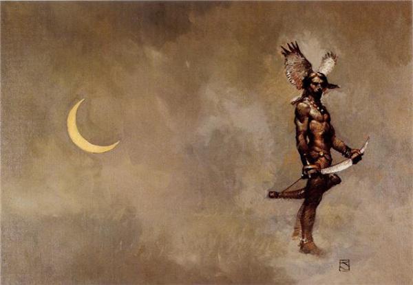
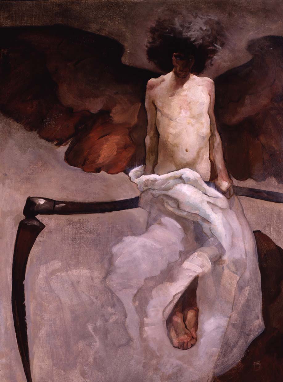
Jeffrey Catherine Jones recently passed away on May 19th, 2011. While I never knew him personally, his work has influenced me. I have bought only 5 prints: a Bernie Wrightson, a Howard Terpning, a Keith Parkinson (whch I gave to my best friend), a Richard Schmid and a Jeffrey Jones which is in my bedroom. He was influenced by many artists throughout his career. I can see Frazetta in there, along with N.C. Wyeth, Frank Schoonover, Harvey Dunn and Mead Shaeffer, and James McNeill Whistler and maybe even Vermeer and Klimt. You can also see influence by his peers at The Studio, Barry Windsor-Smith, Michael Kaluta and Bernie Wrightson. This should not detract from his work in any way, as through all of those influences and more, he was true to himself. He is not a well known artist outside of the comic and fantasy art world. That is sad, for his work goes so far beyond that and like any great illustrator removes the boundary between illustration and fine art. He struggled in his life with his art and his illnesses and his identity. I believe they were going to make a documentary of his life, but I'm unsure if it was ever produced. Thanks for the great work, Jeffrey, I hope you can find peace wherever you have gone.





Two Andrew Loomis Books Available Again

Finally, two classic Andrew Loomis books are available again. Figure Drawing for All It's Worth (available now) and Drawing the Head and Hands (available October). Andrew Loomis is one of the best teacher's of all time and one of my biggest influences. His out of print books go for quite heady amounts of money. It's wonderful that these two classics are back in print, and I hope that more are to come. If you don't have them, I highly recommend picking them up for your library. And since my Figure Drawing for All It's Worth is worn and torn, I will be picking these up once again. Below are a few of Andrew's illustrations and paintings, so you can see just how good he was.


Tuesday, May 10, 2011
Vacuum focus
One way to create a strong center of interest is to use vacuum focus. With vacuum focus you subordinate all other areas through desaturation and hue, leaving the most intense and alien color in the focal area. Marketers use this technique a lot, especially in movie posters.
 Here are two recent blockbusters. In the Batman movie poster, you can see how overall the image is cool and desaturated. The burning bat symbol is in an intense complementary color to the overall blue hue, bringing your eye immediately to it. In the Sherlock Holmes movies poster it's a little more subtle, but the same technique is used. The overall image is a fairly desaturated blue-green, but the faces of the heroes — while also desaturated — are much warmer than the surrounding elements. Notice that even though some of those elements are also people, they are still of the desaturated green color.
They also portray very different ideas...in the Batman poster, the idea of the Batman symbol burning puts to question not only Batman's world going awry, but Batman himself. While the Sherlock Holmes is clearly about the celebrity actors and their characters and relationship. But that's getting a little sidetracked.
You can even use vacuum focusing on in traditional painting. Here are a couple landscapes using that technique.


The first image is by Dennis Sheehan. You can see how the overall feel of the piece is a cool green, but where the sunlight is striking through it is a much more intense and warmer color, kept to a fairly defined area. The second is a Jove Wang painting. Jove is quickly becoming one of my favorite artists. Here you can easily see the overall cool and desaturated colors and how the intense red and orange on the boat leap out at you, creating a strong center of interest.
When planning a painting, vacuum focus can be a great technique to bring about a strong center of interest and a stronger piece of work.
 Here are two recent blockbusters. In the Batman movie poster, you can see how overall the image is cool and desaturated. The burning bat symbol is in an intense complementary color to the overall blue hue, bringing your eye immediately to it. In the Sherlock Holmes movies poster it's a little more subtle, but the same technique is used. The overall image is a fairly desaturated blue-green, but the faces of the heroes — while also desaturated — are much warmer than the surrounding elements. Notice that even though some of those elements are also people, they are still of the desaturated green color.
They also portray very different ideas...in the Batman poster, the idea of the Batman symbol burning puts to question not only Batman's world going awry, but Batman himself. While the Sherlock Holmes is clearly about the celebrity actors and their characters and relationship. But that's getting a little sidetracked.
You can even use vacuum focusing on in traditional painting. Here are a couple landscapes using that technique.


The first image is by Dennis Sheehan. You can see how the overall feel of the piece is a cool green, but where the sunlight is striking through it is a much more intense and warmer color, kept to a fairly defined area. The second is a Jove Wang painting. Jove is quickly becoming one of my favorite artists. Here you can easily see the overall cool and desaturated colors and how the intense red and orange on the boat leap out at you, creating a strong center of interest.
When planning a painting, vacuum focus can be a great technique to bring about a strong center of interest and a stronger piece of work.
Subscribe to:
Posts (Atom)

 Posts
Posts


